
A circular slider whose inertia and autoplay run on CSS alone
Building one with no libraries (part 1 of 3): why CSS interpolation cuts a chord, and how to build both the fan and the Ferris wheel variant
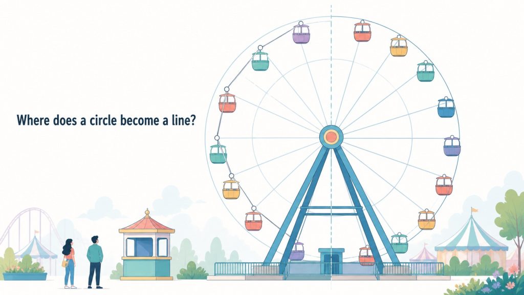
A slider whose slides ride along a circle. Part Ferris wheel, part hand fan. It is a staple of design mockups, and it falls just outside what off-the-shelf slider libraries are built for.
Laying the slides out on the circle is the easy part. One call to Math.sin and you are done. The trouble starts the moment you let go of the drag and hand the coasting motion over to CSS: the ring buckles inward and springs back out, like a rubber band being swung around.
The cause is not performance, and it is not the library you did or did not pick. It is that you told the browser to interpolate an x and a y. This post takes that apart, then rebuilds the slider so that no JavaScript runs at all while it coasts. No dependencies. This is part one of three, and it covers the whole foundation: how to express circular motion in a way the browser can animate. Three live demos are embedded below — spin them as you read.
The obvious build
Placing items evenly around a circle takes almost no thought. Pick a radius, give slide i an angle of 360 / count * i, and turn that into an x and a y.
const RADIUS = 420;
const COUNT = 14;

function layout(ringAngle) {
  items.forEach((el, i) => {
    const deg = ringAngle + (i * 360) / COUNT;
    const rad = (deg * Math.PI) / 180;
    const x = RADIUS * Math.sin(rad);
    const y = -RADIUS * Math.cos(rad);
    el.style.transform = `translate(${x}px, ${y}px) rotate(${deg}deg)`;
  });
}
translate carries the slide to its spot and rotate tips it to follow the curve. Call layout() on every pointermove and the ring tracks your finger perfectly. So far, nothing is wrong.
The problem shows up after you let go. You want the ring to coast, so you hand the job to a CSS transition and write the final angle exactly once. The cubic-bezier(...) in there is the easing: it controls how the speed changes across the transition, and here it says “fast at first, then slowing down”, which is what makes the motion read as momentum.
items.forEach((el) => {
  el.style.transition = 'transform 1.2s cubic-bezier(0.22, 1, 0.36, 1)';
});
layout(ringAngle + glide);
It is about as clean as code gets. And it visibly deforms the circle.
What interpolation actually decides
Interpolation is the browser’s answer to a narrow question: given a start value and an end value, what goes in between?
For opacity, going from 0 to 1, everyone predicts 0.5 at the midpoint. But what is the midpoint between transform: translate(0px, -420px) rotate(0deg) and transform: translate(363px, 210px) rotate(120deg)?
The CSS Transforms spec answers this in some detail, and it describes two different routes.
The first route applies when both ends have the same sequence of functions. If translate lines up with translate and rotate lines up with rotate, the spec interpolates each matching pair on its own. The translate values move independently of the rotate values.
The second route applies when the sequences differ. Then each end is flattened into a 4×4 matrix, and those matrices are decomposed into translation, rotation, and scale components, interpolated component by component, and recomposed.
So here is the first question worth stopping on. If x and y each move independently from translate(0px, -420px) to translate(363px, 210px), what shape does that point trace?
A straight line. Both coordinates advance at a constant rate, so the point takes the shortest path between the endpoints. A straight line between two points on a circle has a name: it is a chord, and because the arc bulges outward, the chord always cuts across the inside.
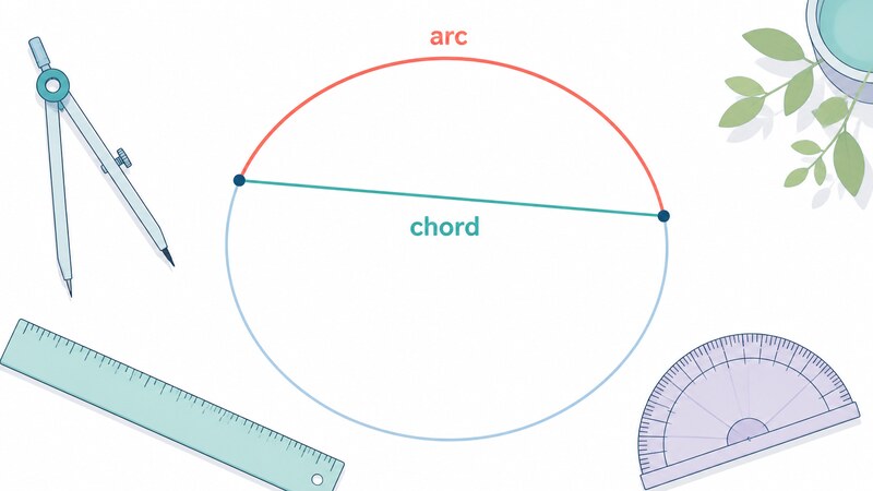
How far inside does it cut?
“Inside” alone does not tell you whether to care. So I measured it. On a circle of radius 420px, varying the angle between the start and end points, here is the distance from the center at the exact midpoint of the interpolation.
These are measured values from Chrome 151. To keep them independent of wall-clock timing, the animation is paused and its currentTime is set directly.
| Angle traveled | Radius at midpoint | Sag | As a fraction |
|---|---|---|---|
| 25.714 degrees (one slide, at 14 slides) | 409.47px | 10.53px | 2.5% |
| 45 degrees | 388.03px | 31.97px | 7.6% |
| 90 degrees | 296.98px | 123.02px | 29.3% |
| 180 degrees | 0px | 420px | 100% |
Advancing by a single slide costs 2.5%, which you would have to look for. Flick the ring hard enough to spin it half a turn and the sag reaches 100%: every slide passes exactly through the center of the circle, collects there, and fans back out. That is the rubber band.
What makes this hard to debug is the discontinuity. While you are dragging, layout() runs every frame, so the path is a perfect circle. The shape only changes at the instant you let go.
That was all numbers. In the demo below, switch between storing the position as x and y and storing it as an angle. Flick it hard and let go: only the x-and-y version buckles inward and springs back. It is the chord from Figure 1, in motion.
Demo 1: the same gesture, with the position stored as x and y and as an angle
The fix is a change of coordinates
Turn that around and the fix appears. The browser is doing nothing wrong; it fills in the values it was handed, linearly. The problem is that we handed it quantities that do not stay on a circle when filled in linearly.
So which quantity does stay on a circle? The angle. Advance an angle at a constant rate and the point travels around the circumference at a constant rate.
CSS has a way to say exactly that.
transform: rotate(30deg) translateY(-420px);
Read it as “turn 30 degrees, then reach out 420px along that direction.” The position is expressed as an angle and an arm length rather than an x and a y. Hold the arm length fixed, move only the angle, and the only thing the browser interpolates is the angle.
Here are the same two endpoints written both ways, sampled through the middle. Radius 150px, moving from 0 to 90 degrees.
held as translate                     held as rotate
 t=0     distance from center 150      t=0     150
 t=0.25  118.59                        t=0.25  150
 t=0.5   106.07   <- 44px inside       t=0.5   150
 t=0.75  118.59                        t=0.75  150
 t=1     150                           t=1     150
The right column never leaves 150. Keeping a circle circular took no special machinery at all.
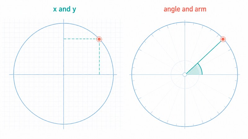
Three angles that add up
With the approach settled, the build falls out. There are three separate reasons a slide is rotated.
The layout angle offsets slide i by 360 / count * i, and never changes after that. The drag angle is what the user contributes through dragging and coasting. The spin angle is the slow autoplay rotation that runs on its own.
Conveniently, rotations about a shared center simply add, and the order does not matter. So keep the three apart and sum them at the end.
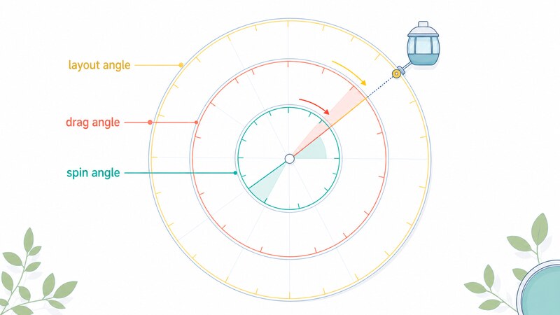
The markup is just as plain. Put a zero-size element at the center of the circle and hang the slides off it.
<div class="arc-slider">
  <ul class="arc-ring">
    <li class="arc-item" style="--i: 0"><div class="arc-face">1</div></li>
    <li class="arc-item" style="--i: 1"><div class="arc-face">2</div></li>
    <li class="arc-item" style="--i: 2"><div class="arc-face">3</div></li>
    <!-- repeat for as many slides as you need, numbering --i from 0 -->
  </ul>
</div>
--i exists only to tell CSS which slide this is. The contents can be images, text, anything. If you change the number of slides, change --count below to match. Get those out of sync and the slides will either overlap or leave a gap.
Teaching the browser that an angle is an angle
The drag angle has to live somewhere that JavaScript can write to, which points at a custom property.
.arc-ring {
  transform: rotate(var(--ring-angle));
}
Worth pausing here. If JavaScript rewrites --ring-angle, does the transition actually fire?
It does. In practice transitionrun fires for transform, and the radius holds at 420px throughout. If a smoothly rotating ring is all you need, this is already enough.
Autoplay is where it falls apart. Animate a custom property from 0 to 120 degrees with @keyframes and sample the middle:
f=0     x=0      y=-420
f=0.25  x=0      y=-420
f=0.49  x=0      y=-420
f=0.51  x=363.7  y=210     <- it jumps here
f=0.75  x=363.7  y=210
f=1     x=363.7  y=210
There is no middle. The value sits at the start until 49% and teleports to the end at 51%. An unregistered custom property is just a string as far as the browser is concerned, never parsed as an angle, and there is no such thing as a string that is half of one value and half of another. Discrete swap is the only option available.
@property is what fixes this. Give the custom property a type and the browser starts treating it as an angle it can interpolate.
@property --ring-angle {
  syntax: "<angle>";
  inherits: true;
  initial-value: 0deg;
}
The same animation, measured again with the property registered:
f=0     x=0      y=-420
f=0.25  x=210    y=-363.7
f=0.49  x=359.3  y=-217.6
f=0.51  x=368    y=-202.3
f=0.75  x=420    y=0
f=1     x=363.7  y=210
Every intermediate step exists, and every one of them sits on the circle of radius 420px. @property reached Baseline in July 2024, so it is relatively new but no longer exotic.
The CSS
@property --ring-angle {
  syntax: "<angle>";
  inherits: true;
  initial-value: 0deg;
}
@property --spin-angle {
  syntax: "<angle>";
  inherits: true;
  initial-value: 0deg;
}

.arc-slider {
  --radius: 420px;        /* circle radius; larger means a flatter arc */
  --count: 14;            /* number of slides; must match the li count */
  --size: 120px;          /* size of one slide */
  --spin-duration: 60s;   /* time for one autoplay revolution */
  --glide-duration: 1.2s; /* time to coast to a stop after release */

  position: relative;
  width: 100%;
  max-width: 760px;
  height: 300px;
  margin-inline: auto;
  overflow: hidden;
  touch-action: none;     /* keep the browser from stealing the drag for scrolling */
  cursor: grab;

  animation: arc-spin var(--spin-duration) linear infinite;
  transition: --ring-angle var(--glide-duration) cubic-bezier(0.22, 1, 0.36, 1);
}

.arc-slider.is-dragging {
  cursor: grabbing;
  animation-play-state: paused;  /* hold autoplay while the user drags */
  transition: none;              /* track the pointer with no easing in between */
}

@keyframes arc-spin {
  to { --spin-angle: 360deg; }
}

/* zero-size element at the center of the circle; this is the axis */
.arc-ring {
  position: absolute;
  left: 50%;
  top: calc(var(--radius) + var(--size) / 2 + 12px);
  width: 0;
  height: 0;
  margin: 0;
  padding: 0;
  list-style: none;
  transform: rotate(calc(var(--spin-angle) + var(--ring-angle)));
}

/* position comes from an angle; no trigonometry anywhere */
.arc-item {
  --item-angle: calc(var(--i) * 360deg / var(--count));
  position: absolute;
  width: var(--size);
  height: var(--size);
  margin: calc(var(--size) / -2);
  transform: rotate(var(--item-angle)) translateY(calc(var(--radius) * -1));
}

.arc-face {
  width: 100%;
  height: 100%;
  border-radius: 12px;
  overflow: hidden;
}

@media (prefers-reduced-motion: reduce) {
  .arc-slider { animation: none; }
}
The var(--size) / 2 + 12px added to .arc-ring‘s top is breathing room so the topmost slide is not clipped by the container’s top edge. Raise the 12px to push the whole arc down.
The JavaScript
All the JavaScript does is rewrite one angle while a drag is in progress.
const slider = document.querySelector('.arc-slider');
const ring = slider.querySelector('.arc-ring');

let angle = 0;      // the drag angle; never wrapped to 0-360, just accumulated
let dragging = false;
let startPointer = 0;
let startAngle = 0;
let last = { a: 0, t: 0 };
let velocity = 0;   // degrees per millisecond

// .arc-ring has zero size, so its position is the center of the circle
function pointerAngle(ev) {
  const c = ring.getBoundingClientRect();
  return (Math.atan2(ev.clientY - c.top, ev.clientX - c.left) * 180) / Math.PI;
}

function setAngle(a) {
  slider.style.setProperty('--ring-angle', `${a}deg`);
}

slider.addEventListener('pointerdown', (ev) => {
  // if grabbed mid-coast, freeze at whatever angle is on screen right now
  angle = parseFloat(getComputedStyle(slider).getPropertyValue('--ring-angle')) || 0;
  slider.classList.add('is-dragging');
  setAngle(angle);

  dragging = true;
  slider.setPointerCapture(ev.pointerId);  // keep following outside the box
  startPointer = pointerAngle(ev);
  startAngle = angle;
  last = { a: angle, t: ev.timeStamp };
  velocity = 0;
});

slider.addEventListener('pointermove', (ev) => {
  if (!dragging) return;

  let delta = pointerAngle(ev) - startPointer;
  delta = ((delta + 540) % 360) - 180;   // avoid a full-turn jump on grab
  angle = startAngle + delta;
  setAngle(angle);

  const dt = ev.timeStamp - last.t;
  if (dt > 0) {
    velocity = (angle - last.a) / dt;
    last = { a: angle, t: ev.timeStamp };
  }
});

function release() {
  if (!dragging) return;
  dragging = false;
  slider.classList.remove('is-dragging');

  // write the coasting angle once and hand the rest to CSS
  const glide = Math.max(-720, Math.min(720, velocity * 420));
  angle += glide;
  setAngle(angle);
}

slider.addEventListener('pointerup', release);
slider.addEventListener('pointercancel', release);
The 420 in velocity * 420 is how far a flick is stretched out; raise it and one flick travels further. The clamp at plus or minus 720 degrees stops a hard flick from spinning for several revolutions.
Nothing runs while it coasts
This is the part I most wanted to confirm. Between letting go and coming to rest, is JavaScript genuinely idle?
I measured it in a real browser. For 1.4 seconds after release, a MutationObserver counted every change to style and class while the distance from the center was recorded for all 14 slides on every frame.
frames: 84
styleWritesDuringGlide: 0
minDistEver: 420   maxDistEver: 420
Across 84 frames, JavaScript wrote nothing at all, and all 14 slides stayed at exactly 420px from the center. The coasting motion and the autoplay rotation layered on top of it both ran entirely on the browser’s side.
Run the same test against the naive implementation and that distance never stays at 420px. How far it strays depends on how hard you flicked, which is what the table above quantifies: half a turn takes the slides through the center.
Keeping the slides upright
So far the slides tilt to follow the curve, which fans out nicely. But tilted photos and tilted text are unreadable, and that is most of what people put in a slider.
A Ferris wheel keeps its cabins level no matter how far the wheel turns. Same idea here, and the recipe is short: cancel out exactly the rotation the slide picked up.
The angles to cancel are the three we just added together — layout, drag, and spin. Negate their sum and apply it to the slide’s contents.
.arc-slider.is-upright .arc-face {
  rotate: calc(-1 * (var(--spin-angle) + var(--ring-angle) + var(--item-angle)));
}
That is the entire feature. Add is-upright to .arc-slider for the Ferris wheel, drop it for the fan.
Why does this need no JavaScript? Because all three angles are either registered with @property or constant. The browser is already interpolating those angles to turn the ring, and the cancelation reads the very same values. The ring and its contents always see the same instant, so they cannot drift apart.
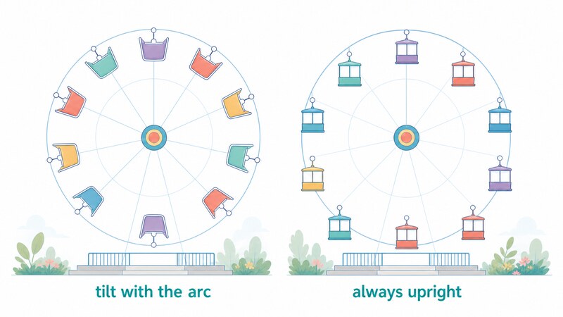
Verifying “upright” turned out to be more interesting than expected. My first idea was to use the fact that a tilted square has a larger axis-aligned bounding box. For a 120px square tilted by theta, the bounding box side is 120 * (|cos theta| + |sin theta|) — which returns to 120 whenever theta is a multiple of 90 degrees. That measurement cannot tell a slide lying on its side from one standing straight up.
So I changed the measurement. Each slide got a small marker in one corner, and I measured the direction from that marker to the slide’s center. Upright reads as 45 degrees; tipped over by 90 degrees reads as 135. No ambiguity left.
Then I paused the transition that turns the ring 640 degrees and stepped it from 0% to 100%, measuring all 14 slides at each step.
f=0     --ring-angle=17deg       max tilt 0 degrees
f=0.25  --ring-angle=506.513deg  max tilt 0 degrees
f=0.5   --ring-angle=632.285deg  max tilt 0 degrees
f=0.75  --ring-angle=655.012deg  max tilt 0 degrees
f=1     --ring-angle=657deg      max tilt 0 degrees
The ring turns 640 degrees, the slides pass through every orientation there is, and the tilt stays at exactly 0 the whole way. Not just at the endpoints.
There is a bonus in that log. --ring-angle covers 17 to 506 degrees in the first quarter and then inches toward 657. That shape is the easing specified earlier, visible in the numbers.
In the demo below, switch between the fan and the Ferris wheel. The radius, the slide count and the flick reach are all live, so you can see which number in the code controls what. They start at the same values the code uses: 420px, 14 slides, 420.
Demo 2: switch between the fan and the Ferris wheel, and change radius, count and flick reach live
Pitfall one: never wrap the angle
An angle that grows without bound feels untidy, so the urge to write angle % 360 is strong. Resist it.
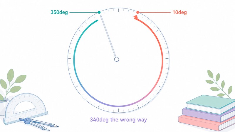
Here is 350 degrees to 10 degrees, and the same move written without wrapping as 350 to 370.
350deg -> 10deg (wrapped)
 t=0    at 350 degrees
 t=0.25 traveling counterclockwise
 t=0.5  bottom of the circle (180 degrees)   <- 340 degrees the wrong way
 t=1    at 10 degrees

350deg -> 370deg (not wrapped)
 t=0    at 350 degrees
 t=0.5  top of the circle (360 degrees)      <- a 20 degree advance
 t=1    at 370 degrees
A 20 degree nudge becomes a 340 degree trip in the opposite direction. The browser interpolates the numbers it was given, and given 350 and 10 it correctly decreases. It has no way to know those two numbers name the same place.
This one is hard to believe in prose. In the demo below, put the wrapped and the unwrapped version side by side. Both buttons mean “advance by 20 degrees.”
Demo 3: what happens when you move from 350 degrees to 10 degrees
Now for the confusing part. The spec contains the line "Don't rotate the long way around", which appears to contradict everything just measured.
So which is it? Both, in different places. That rule is a preprocessing step on the second route — the one that flattens both ends into matrices and decomposes them. It does not apply when matching functions are interpolated directly.
To confirm, I deliberately wrote a pair of transforms that falls onto the matrix route.
matching function lists   t=0.5 at the bottom of the circle   <- 340 degrees the wrong way
matrix route              t=0.5 at the top of the circle      <- the short 20 degrees
The matrix route does take the short way, exactly as specified. But hold the applause: the position recorded there was 413.6px from the center, not 420px. Even on the matrix route, the translation component is interpolated linearly, so it still travels along a chord.
Both routes join positions with a straight line. The only way to keep a circle circular is to express the position as an angle in the first place.
Pitfall two: individual transform properties cannot orbit
CSS also offers rotate: and translate: as standalone properties, separate from transform. They are shorter, so swapping them in is tempting.
/* this */
transform: rotate(45deg) translateY(-150px);

/* and this — the same thing? */
rotate: 45deg;
translate: 0 -150px;
Not the same. Measured:
transform: rotate(45deg) translateY(-150px)   ->  (506.07, 193.93)
rotate: 45deg; translate: 0 -150px;           ->  (400, 150)
Completely different places. The individual properties apply in a fixed order defined by the spec — translate, then rotate, then scale, then whatever is in transform — and you cannot reorder them. “Turn, then reach out” is not expressible; you only get “reach out, then spin in place.”
Note that both land 150px from the center. If you are checking the radius, this mix-up is invisible. In orbital terms: you wanted revolution and you got rotation.
Which is also why the upright variant above uses rotate: on purpose. Spinning the contents in place is exactly what individual properties are good at.
Loose ends
touch-action: none is already in the CSS. It stops the browser from claiming a horizontal drag for page scrolling; without it, half the pointer movement is swallowed and the slider feels unresponsive.
setPointerCapture is in there too. It keeps pointer events targeted at the slider even after the pointer leaves its bounds, which is usually the fix when a fast drag mysteriously cuts out partway.
prefers-reduced-motion is honored as well. A permanently rotating element is a real accessibility problem for some people, and the structure here lets you switch off only the autoplay while leaving manual dragging intact.
Keyboard support is not covered here. For production you will want arrow keys to advance one slide and a focus path through the slides themselves.
Wrapping up
The circle collapses for exactly one reason: the position was stored as an x and a y.
Hand the browser x and y and it draws a straight line between them. If those points are on a circle, the line is a chord. Store the position as an angle and an arm length instead, and the quantity being interpolated becomes the angle, so the path comes out circular for free.
The side effect is that JavaScript nearly disappears. In the code above, the only thing JavaScript ever writes is one custom property holding an angle. Coasting, autoplay, and the upright cancelation all happen on the CSS side.
Part two builds the same thing on top of Swiper.js, where the library writes transform itself. How far the “store it as an angle” approach can be carried into someone else’s transform pipeline is the question there.
All measurements here come from Chrome 151 on Windows 11. The interpolation rules themselves are specified, so large differences are unlikely, but I have not verified other browsers. Nor have I tested the feel of it on a real touch device.
The three demos were checked on that same Chrome 151. Every number they illustrate is also written out in the prose, so the argument still holds where the demos do not run.
Primary sources
- CSS Transforms Module Level 1 — Interpolation of Transforms (the two routes, depending on whether the function lists match)
- CSS Transforms Module Level 1 — Interpolation of decomposed 2D matrix values (the
"Don't rotate the long way around"rule) - CSS Transforms Module Level 2 — Individual Transforms (the fixed order of
translate,rotate, andscale) - MDN —
@property(typing a custom property, and browser support) - Pointer Events Level 3 —
setPointerCapture()(keeping events targeted after the pointer leaves) - Media Queries Level 5 —
prefers-reduced-motion(detecting a preference for less motion)